To architect a maximalist gallery wall that feels like a curated exhibition rather than a chaotic collision, you must apply the “Visual Anchor” Protocol. In a high-performance interior, the goal is to balance high-density imagery with a sophisticated mathematical rhythm. By treating the wall as a single monolithic skin—similar to a complex UI dashboard—you can mix disparate elements while maintaining architectural authority.
1. The Hero Asset Strategy
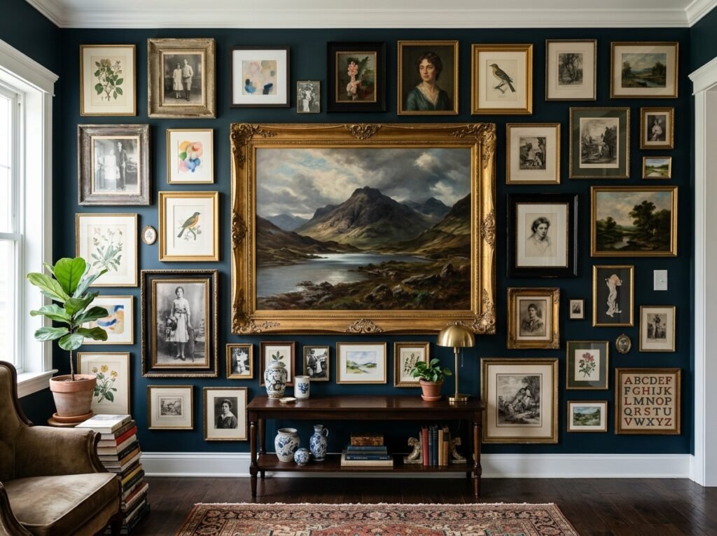
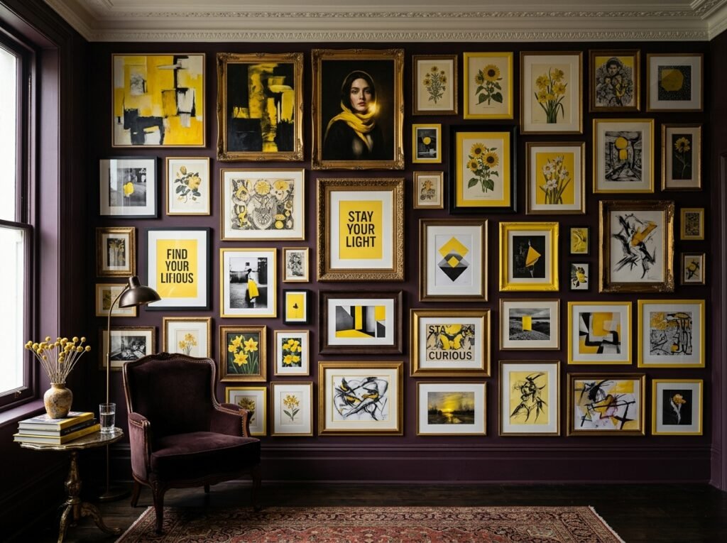
A common mistake in maximalism is using only small pieces, which causes the eye to “skitter” across the wall without finding a place to rest. You need a primary focal point to ground the composition. This strategy involves choosing one “Hero” piece that is at least 50% larger than any other item on the wall. Position this piece slightly off-center to break the predictable “bullseye” symmetry and create a more dynamic, editorial flow that leads the eye naturally through the rest of the collection.
2. Geometric Grid vs. Organic Cluster
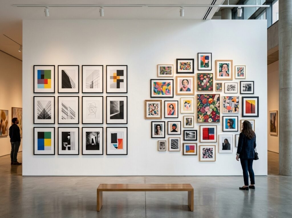
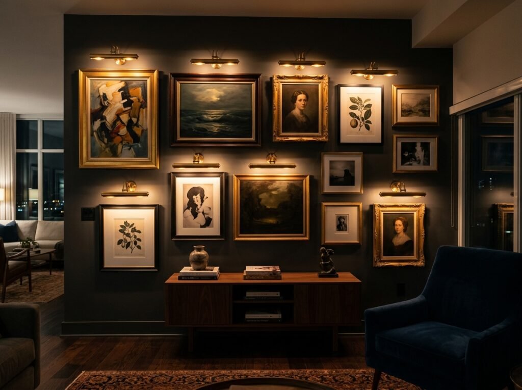
Decide on your structural DNA before the first nail is driven. A formal grid uses identical frames with tight, uniform spacing, which works best if the art inside is diverse, as the rigid framing provides the necessary order. Alternatively, an organic cluster utilizes mismatched frames in gold, black, and wood. To make this look intentional, you must maintain a consistent “gutter” width—the space between frames. Whether it is 1 inch or 3 inches, keeping that gap uniform across the entire wall acts as the connective tissue that unifies the chaos.
3. The Triple-Threat Content Mix
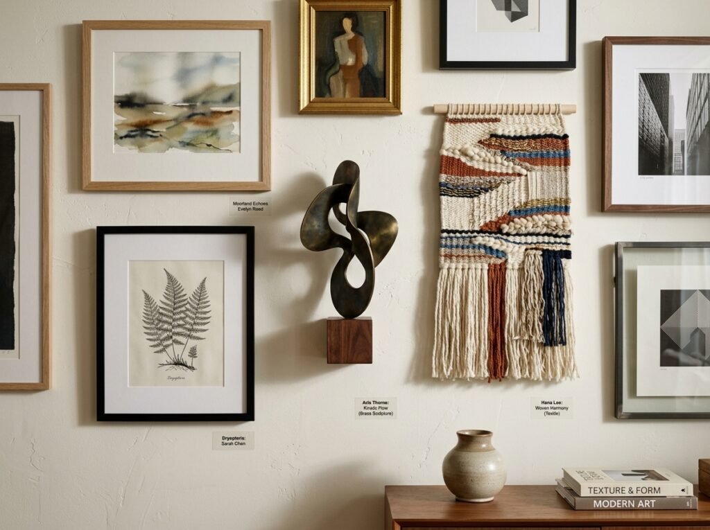
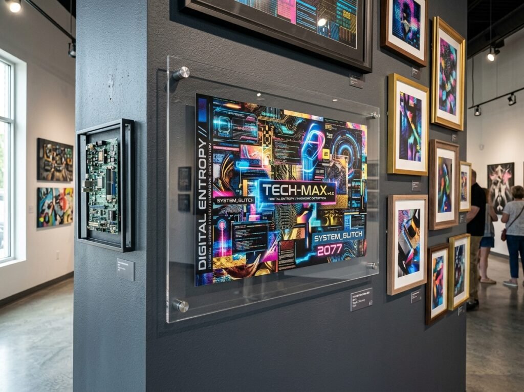
A professional gallery wall is not just a collection of flat paper; it requires tactile depth to feel fully realized. You should categorize your media into three distinct layers. First, the 2D flat art consisting of photography and typography. Second, 3D objects such as brass sculptures, antique clocks, or even a small shelf holding a tech artifact. Finally, a textile element like a framed piece of silk or a small hanging tapestry. This multi-dimensional approach prevents the wall from feeling “flat” and adds the physical complexity expected in high-end maximalism.
4. Color Drenching and The Key Hue
To unify a maximalist wall, utilize the subconscious bridge of color. Pick one “Key Hue”—such as a deep saturated purple or a vibrant primary red—and ensure this color appears in at least 30% of the pieces, regardless of their individual style. For maximum drama, paint the wall behind the gallery in a dark, matte color. This “color drenching” foundation makes the frames pop and effectively hides the shadows cast by 3D objects, making the entire installation feel like a single, cohesive unit rather than a series of hanging boxes.
5. The Glassmorphism Break
In an environment filled with high-density patterns and ornate frames, the eye needs a “visual reset.” This is where you introduce the principle of Glassmorphism—using transparency to soften transitions. Include at least one or two acrylic “floating” frames within your layout. Because these frames are transparent, they allow the wall color to show through, creating a blurred, modern layer. This tech-forward touch bridges the gap between vintage art and modern architecture, ensuring the wall feels relevant to a contemporary professional space.
6. The Surgical Finishing Touch: Lighting
Lighting is what separates a home project from a designer installation. Once the art is mounted, you must address the lighting architecture. Use warm-dim (2700K) spotlighting or battery-operated brass picture lights mounted directly above your “Hero” assets. Angle the lights to graze across the frames; this emphasizes the texture of the 3D objects and the carvings of vintage frames, creating deep, intentional shadows that add to the moody, maximalist atmosphere and high-resolution visual quality.
Performance Specification Matrix
| Strategy | Primary Benefit | Difficulty | Aesthetic DNA |
| Hero Anchor | Visual Hierarchy | Low | Editorial / Bold |
| Gutter Protocol | Mathematical Order | Medium | Architected / Clean |
| 3D Integration | Tactile Depth | Medium | Curated / Antique |
| Glassmorphism | Visual Breathing Room | Low | Modern / Tech |
Pro-Execution Protocol
- The Mapping Phase: Trace all frames onto Kraft paper and tape them to the wall before hammering. This allows you to audit the “Visual Weight” of the arrangement without damaging the surface.
- The 10% Diversity Rule: Include at least one piece of art that falls completely outside your usual taste. This “Wildcard” prevents the wall from feeling like a repetitive echo chamber and introduces the discovery element found in professional galleries.
- Laser Precision: Use a 360-degree laser level to ensure the “horizon line” of your central cluster is perfectly straight. Even in a maximalist “cluttered” look, a skewed horizontal axis will trigger a subconscious sense of disorder.