Mixing bold patterns is a technical exercise in Visual Hierarchy. In high-end maximalist or “NeoBrand” design, the goal is to create a space that feels “energetically charged” but remains architecturally organized. To prevent the room from looking messy, you must manage the rhythm, scale, and saturation of every textile and surface.
Here is the professional protocol for mixing bold patterns with surgical precision.
1. The “Scale Variance” Rule (60/30/10)
The primary reason mixed patterns look “messy” is Scale Competition. If all patterns are the same size, the eye has no place to land.
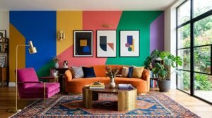
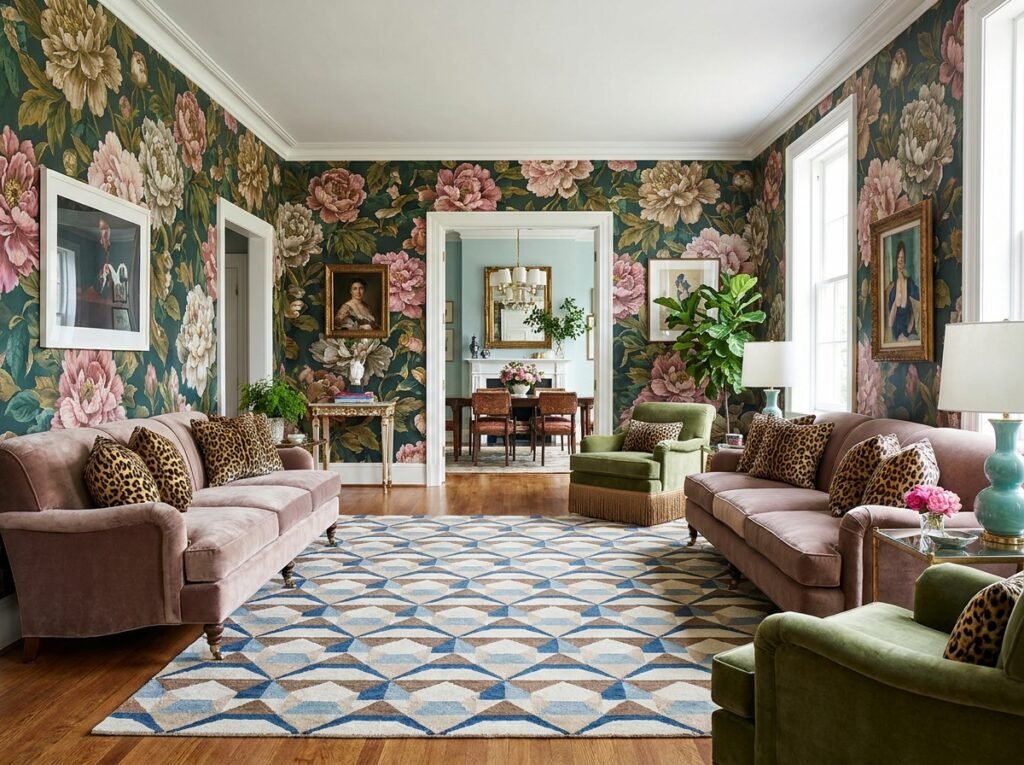
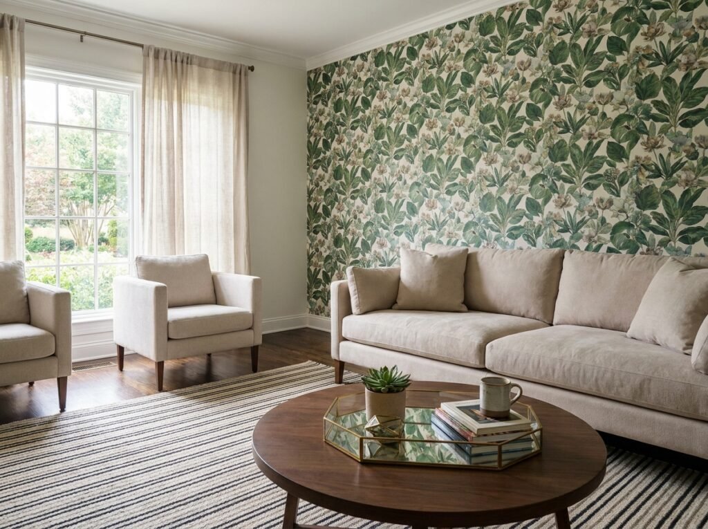
- The Hero (60%): Choose one large-scale pattern (e.g., an oversized floral or wide 18-inch stripes). This anchors the room.
- The Supporting Actor (30%): Choose a medium-scale pattern (e.g., a standard geometric or a “NeoBrand” purple #745acc trellis).
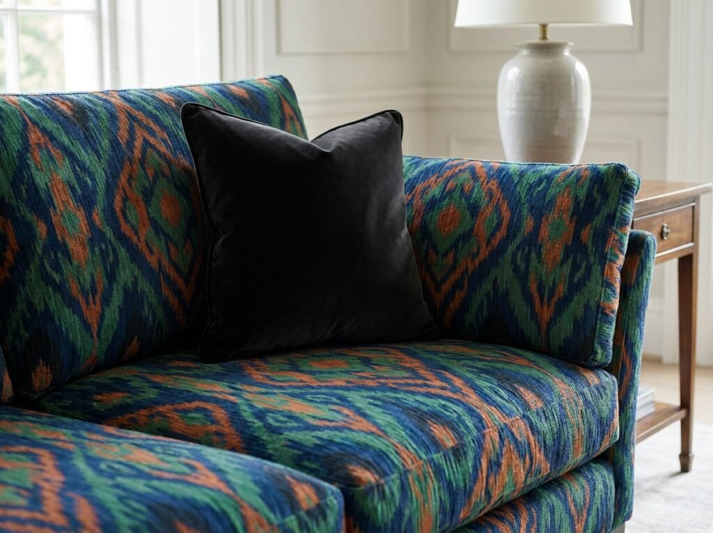
- The Detail (10%): Choose a small-scale, high-density pattern (e.g., a ditsy floral, a pinstripe, or an animal print).
2. The “Common Thread” Color Strategy
Patterns can be completely different in style (e.g., a Victorian damask and a modern FPV drone-inspired grid) as long as they share a Unified Palette.
- The Strategy: Pick one “Key Color” and ensure it appears in every pattern. If your key color is Aubergine, it should be the background of the rug, the petal of the floral curtain, and the stripe on the pillow. This creates a “subconscious bridge” that makes the room feel cohesive.
3. The “Solid Anchor” Buffer
Pattern-on-pattern creates visual fatigue. You must introduce “Visual Breathing Room” using solid blocks of color.
- The Strategy: Use a solid-colored sofa to break up a patterned rug and a patterned wall.
- The “Black Anchor” Rule: In a room of bold patterns, Matte Black or a deep charcoal acts as an “outline.” It contains the patterns and provides a heavy visual weight that grounds the “chaos.”
4. Categorize by Pattern “Type”
For a professional-grade mix, balance the “DNA” of the patterns:
- Organic: Florals, botanicals, or animal prints (soft, curving lines).
- Linear: Stripes or checks (predictable, rhythmic lines).
- Geometric: Trellis, Moroccan tile, or abstract grids (mathematical shapes).
- The Protocol: Pair one Organic with one Linear and one Geometric. This ensures a 360-degree range of visual textures.
5. Use “Glassmorphism” to Soften Transitions
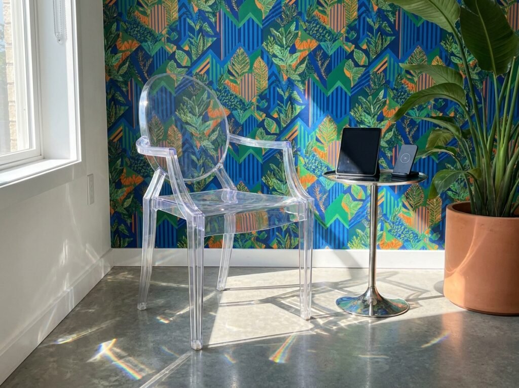
When two bold patterns meet (like a sofa and a wall), use transparency to blur the boundary.
- The Tech Move: An acrylic side table or a glass coffee table allows the eye to see “through” to the patterns without adding a new opaque color. This keeps the room feeling “airy” despite the density of the patterns.
Pattern Mixing Specification Table
| Pattern Layer | Scale | Style | Purpose |
| Wall / Wallpaper | Large | Organic (Floral) | The “Hero” Narrative |
| Area Rug | Medium | Linear (Stripe) | The Rhythmic Foundation |
| Primary Furniture | Solid | N/A | The Visual Buffer |
| Accents (Pillows) | Small | Geometric / Animal | The Detail Complexity |
Technical Pro-Tips for “Visual Authority”
- Directional Logic: If you have a striped rug, run the stripes perpendicular to the entrance of the room. This makes the room feel wider.
- High-CRI Lighting: Bold patterns rely on color accuracy. Use bulbs with a CRI of 95+ to ensure your “NeoBrand” purples and deep teals don’t turn muddy at night.
- The “Squint Test”: Stand at the entrance of the room and squint your eyes. If the room looks like a single grey blur, you need more contrast. If one pattern “shouts” louder than the rest, you need to tone it down with a solid-colored object.
Are you planning to mix these patterns in a high-traffic area like a living room, or a more intimate space like a maximalist bedroom?