
The combination of sage green and cream is a cornerstone of “soft-minimalist” design. This palette works because it bridges the gap between traditional warmth and modern clarity. Sage green acts as a muted, earthy neutral, while cream provides a softer, more inviting alternative to stark architectural white.
When applied to a kitchen, these tones create a low-stress environment that feels both fresh and established. Achieving this look requires a focus on matte finishes, natural light, and the strategic use of organic materials.
1. Defining the Palette: Muted Sage and Warm Cream
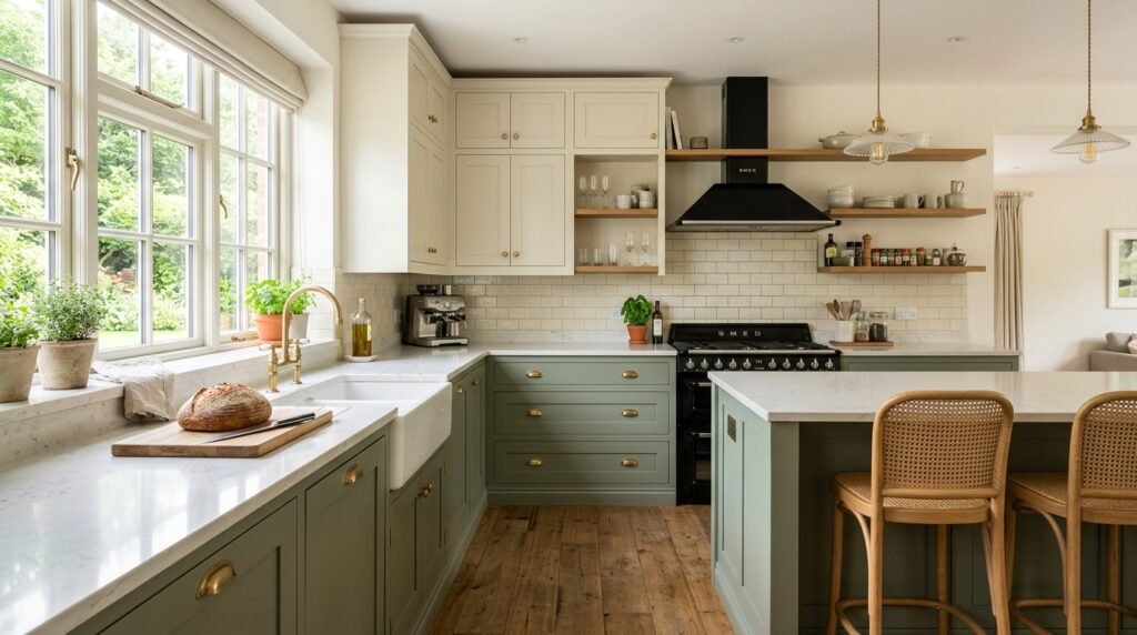
For a balanced aesthetic, use sage green for the base cabinets and cream for the upper cabinets or walls. This “weighted” approach keeps the kitchen feeling grounded while the lighter cream tones at eye level prevent the space from feeling enclosed.
Selecting the right “undertone” is critical. Choose a sage with a grey or olive base to keep it sophisticated, and a cream that leans toward oatmeal or ivory rather than yellow. This ensures the colors feel modern and “dusty” rather than dated.
2. Incorporating Light Wood Accents
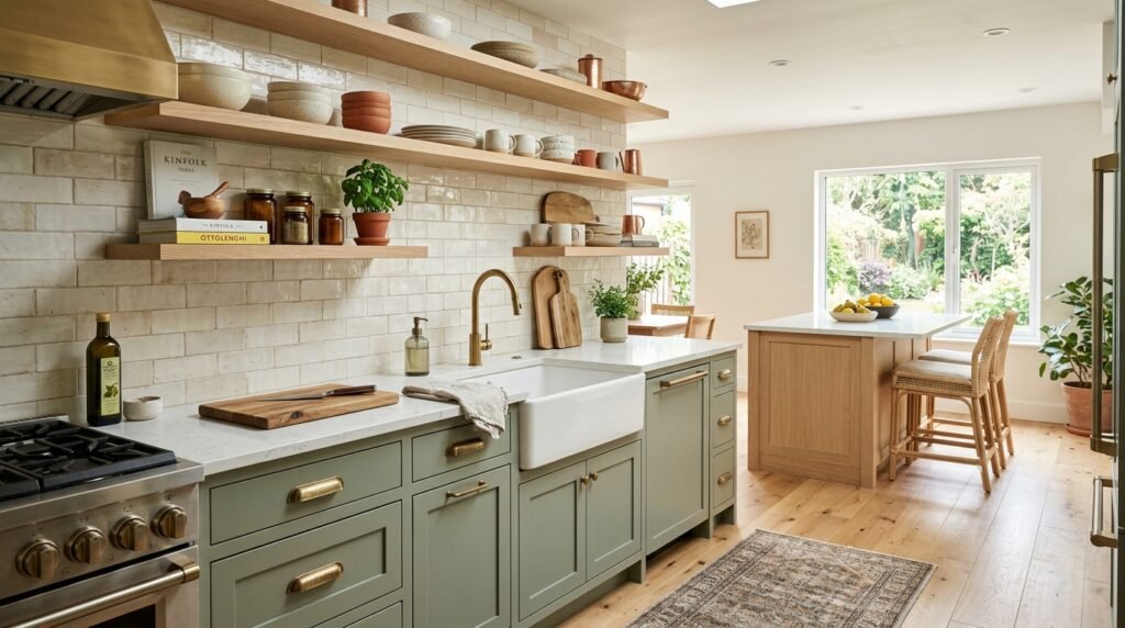
To enhance the “cozy” factor, integrate light-toned woods such as white oak, ash, or maple. Wood brings a necessary organic warmth to the sage and cream palette. This can be achieved through open shelving, a dedicated butcher-block island, or even wooden bar stools.
The natural grain of the wood provides a subtle pattern that breaks up the solid blocks of color. In a sage and cream kitchen, light wood acts as a “bridge” material that ties the earthy green and the airy cream together.
3. Selecting Matte Stone Countertops
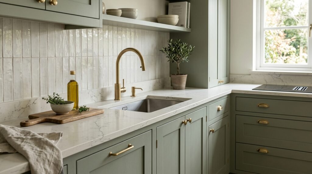
A high-gloss countertop can look too clinical for a soft aesthetic. Instead, opt for a “honed” or matte finish. Cream-colored quartz with very subtle veining or a light grey limestone provides a soft, tactile surface that complements the muted paint colors.
A matte surface diffuses light rather than reflecting it harshly, which is essential for maintaining a calm, inviting atmosphere. This choice reinforces the “organic” feel of the kitchen, making the workspace feel more like a piece of furniture than an industrial station.
4. Hardware: Brushed Brass and Toned Metals
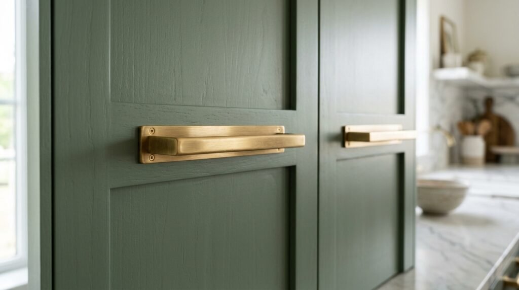
Hardware is the primary accent in a kitchen. For a sage and cream palette, brushed brass or champagne gold is the professional choice. These “warm” metals enhance the yellow tones in the cream and provide a beautiful, soft contrast against the green.
Avoid high-shine chrome or polished nickel, which can feel too “cool” and disrupt the soft aesthetic. If you prefer a more rustic look, matte black hardware can be used to add a touch of modern “edge” without overpowering the delicate color scheme.
5. Backsplash Texture: Handmade Zellige or Subway Tile
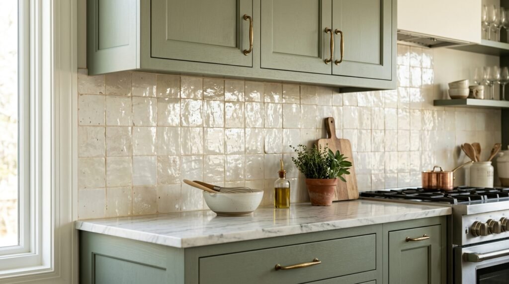
The backsplash is an opportunity to introduce subtle texture. Handmade tiles, such as Zellige, are ideal because each tile has slight variations in color and shape. A cream-colored Zellige backsplash will catch the light in different ways, adding a “shimmer” that keeps the kitchen from looking flat.
If you prefer a cleaner look, a standard subway tile in a “crackle” glaze or an off-white tumbled stone can achieve a similar effect. The goal is to avoid perfect, machine-made uniformity in favor of something that looks hand-crafted.
6. Textiles: Linen and Woven Natural Fibers
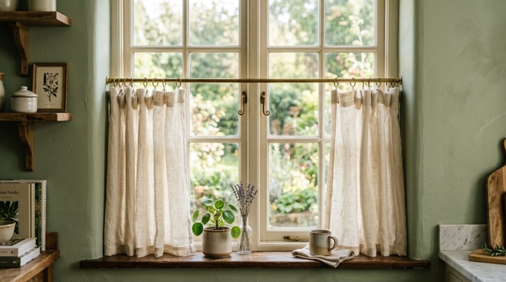
Softness in a kitchen is often achieved through textiles. Use cream-colored linen for window treatments or a woven jute runner on the floor. These materials introduce a “soft” surface that absorbs sound and adds a layer of physical comfort.
Linen, in particular, has a relaxed drape that fits the soft aesthetic perfectly. Using a sage green and cream gingham or a simple striped tea towel draped over the oven handle adds a functional, cozy detail that reinforces the color story.
7. Lighting: Soft Warmth and Natural Exposure
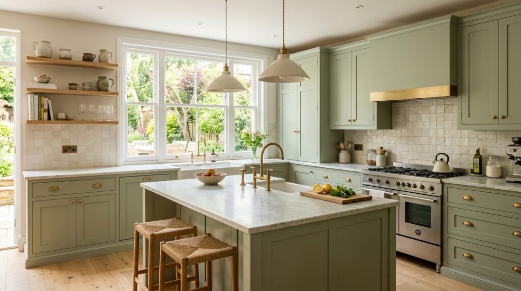
Lighting for a sage and cream kitchen should mimic natural sunlight as much as possible. Use bulbs in the 3000K range (Warm White) to ensure the cream looks crisp and the sage looks vibrant.
Consider using “dome” style pendant lights in a cream ceramic or a matte metal finish. These focus the light downward onto the work surfaces while contributing to the room’s overall “soft” geometry. Avoid overly industrial or “edgy” fixtures that might clash with the gentle color palette.
8. Integrated Sinks and Functional Ceramics
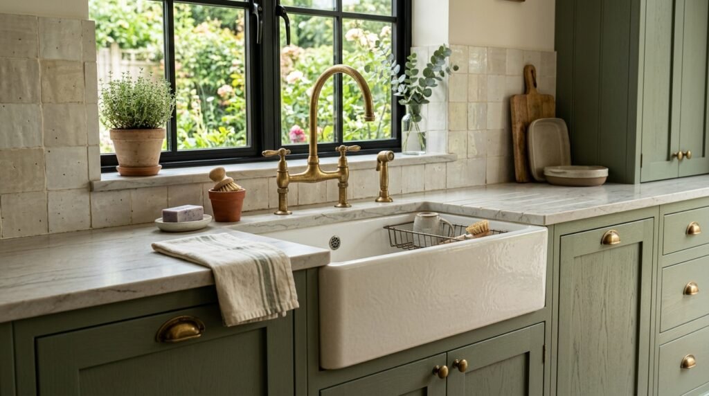
A cream-colored “apron-front” or farmhouse sink is a classic element for this aesthetic. It provides a large block of cream color at the center of the sage cabinetry, acting as a functional focal point.
To finish the look, display ceramic canisters or stoneware crocks in varying shades of cream and sage. This “curated utility” ensures that even the items you use daily contribute to the room’s overarching design theme.
9. Cost & Budget Considerations
A sage and cream transformation can be achieved through several budget-friendly routes:
- Cabinet Refacing: If your cabinet boxes are in good shape, simply replacing or repainting the doors in sage green is a high-impact, medium-cost solution ($1,500–$3,500).
- Paint Selection: A few gallons of high-quality “cabinet grade” paint in sage green and cream can change the entire room for under $400.
- Hardware Swap: Changing handles to brushed brass ($10–$20 each) is a quick way to elevate the look for a few hundred dollars.
Common Mistakes to Avoid
- Overly Yellow Creams: If the cream is too yellow, it can make the sage green look “muddy.” Always test paint samples together in your kitchen’s specific light.
- Cool Lighting: Never use “Daylight” (5000K) bulbs. They will turn your sage green into a cold, clinical grey and make the cream look like a hospital white.
- Too Much Contrast: Avoid using stark black or bright white. The strength of this aesthetic lies in its “low-contrast” nature; every element should blend softly into the next.
FAQ
Will sage green make my kitchen look dark?
Sage is a “mid-tone” color, meaning it has enough depth to provide character without being as dark as navy or black. When paired with cream upper cabinets and good lighting, it can actually make a kitchen feel more balanced and airy.
What floor color goes best with sage and cream?
Light-to-medium wood floors (like Oak or Hickory) are the best choice. If you prefer tile, look for a light-grey stone or a cream-toned “terrazzo” to keep the palette soft and organic.
Is sage green a “trendy” color that will go out of style?
Sage green is considered a “nature-based neutral.” Because it is rooted in the natural world, it tends to be more timeless than artificial “trend” colors. It has been a staple in kitchen design for decades and remains a versatile choice for resale value.